 Cinderby SPELL
Built from
tension.
An editorial, high-contrast Shopify theme engineered for apparel and streetwear — a signature mega menu with a live product rail, 35+ sections, and everything editable from the customizer. Accessible and fast by design.
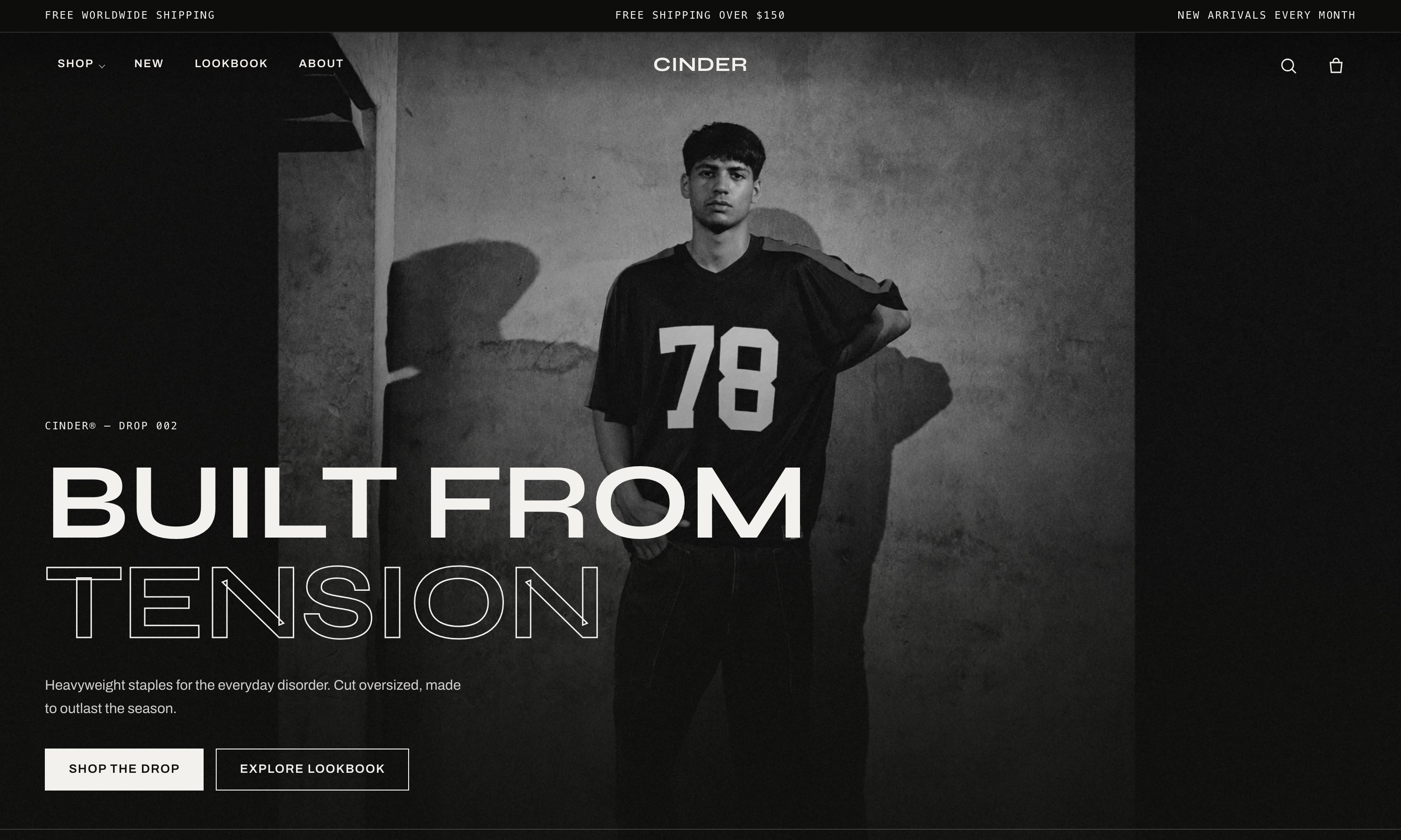
Everything a modern apparel store needs — nothing it doesn’t.
Cinder pairs an unmistakable editorial identity with the merchandising tools that actually move product, and the engineering discipline that keeps your store fast and inclusive.
Sections everywhere
Built on Online Store 2.0 — add, remove, and reorder sections on every page, including product and collection. Every heading, image, and label is editable in the theme editor. No code.
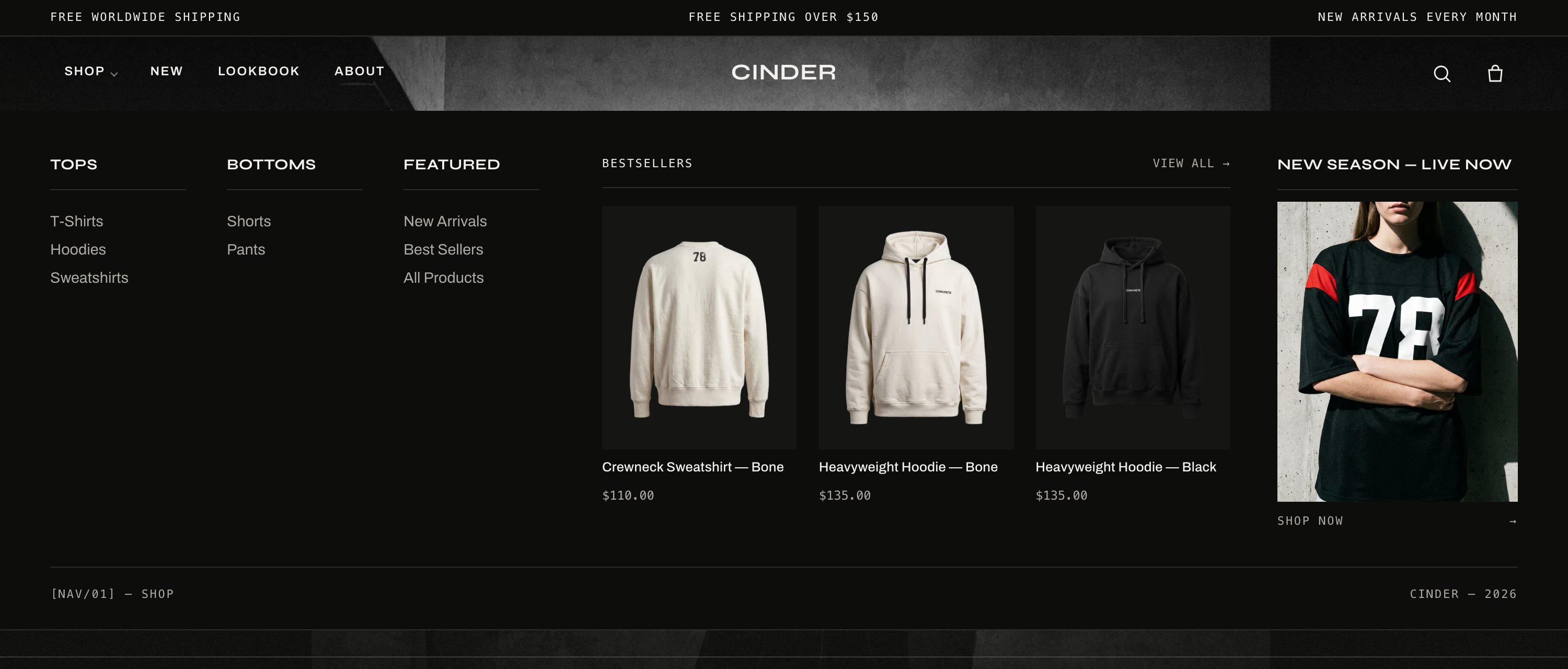
Signature mega menu
A desktop mega menu that fills its space: navigation columns built from your menu, a live product rail pulled from any collection, and an editorial promo card. Fully responsive and keyboard-operable.
Merchandising built in
Native filtering & sorting, predictive search, quick view and quick add, complementary and recently-viewed rails, a free-shipping bar, and a slide-in cart — the tools that lift conversion and AOV.
Editorial media
A cinematic hero, a shop-the-look lookbook, an editorial gallery/filmstrip, video, a before/after slider, and marquees — the storytelling range a fashion brand needs, all art-directed.
Accessible by design
Keyboard-operable menus, drawers, galleries and sliders; visible focus states; labeled controls and aria-expanded triggers; a skip link; and full prefers-reduced-motion support. WCAG-minded throughout.
Fast & self-contained
No external fonts, scripts, or CDNs. Responsive images with an eager LCP, lazy-loading below the fold, deferred JavaScript, and no layout shift — engineered to protect your Core Web Vitals.
Every section you need to build the whole store.
A deep, art-directed section library — compose homepages, product pages, collections, and content pages freely. Each one is fully configurable, with color schemes, spacing, and repeatable blocks.
Cinematic banner with eyebrow, emphasized heading, two CTAs, scrim, and spec marks. Your page’s H1.
Rotating slides with swipe, dots, and accessible (off-by-default) autoplay.
Full-width call-to-action over an image with a scrim for legibility.
A scrolling band of brand phrases — texture and motion between sections.
Side-by-side image and story block; alternate the media side down a page.
A centered or left editorial statement — manifesto or pause.
2–4 columns with icon, heading, and text — feature or spec grids.
Editorial grid or filmstrip with captions, corner marks, and B&W-on-hover.
Multi-look filmstrip with a shoppable product list beneath each look.
Hosted or YouTube/Vimeo video with poster and play overlay.
Draggable, keyboard-operable image comparison.
Accessible accordions for FAQs, care, and specs.
Styled contact form wired to Shopify, with a success state.
Inject custom Liquid/HTML for one-off needs.
Products from a collection as a grid or swipeable rail.
Spotlight one product with media and a compact buy area.
A grid of collections so shoppers jump into a category.
Recent articles as cards — an editorial teaser.
Shopify-powered product rails that lift AOV.
Customer quotes with optional score and attribution.
“As seen in” partner and press credibility marks.
Two or more promo tiles to split attention between campaigns.
A bold editorial image/message split for a season.
A drop countdown band — pairs with the Signal scheme.
Email capture wired to Shopify customer signup.
An optional, accessible timed offer popup.
Signature functionality, engineered end to end.
A mega menu that sells
The desktop mega menu turns navigation into merchandising. It builds link columns from your menu, then adds a live product rail and an editorial promo card — no empty space, all shoppable.
- Columns generated automatically from your menu structure
- A featured-products block pulls real products (image, title, price) from any collection
- An editorial promo card with image, heading, and link
- Responsive down to a clean mobile drawer; fully keyboard-operable
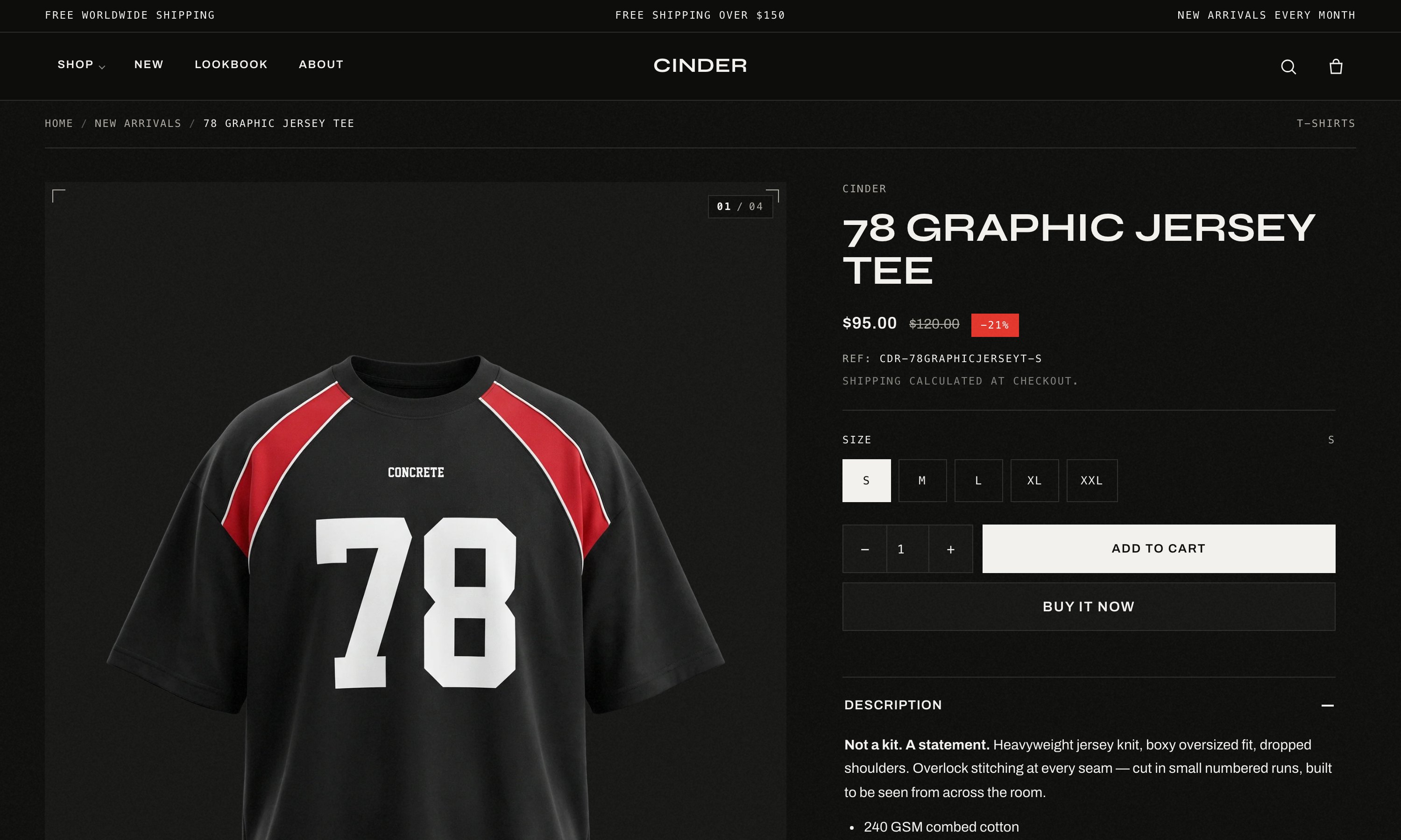
A product page that converts
An editorial media gallery beside a sticky buy column — with a mono frame counter, zoom, video and 3D. The buy area covers everything shoppers expect and a few things they’ll love.
- Variant swatches that update price, availability, and gallery
- Size guide, back-in-stock notifications, and gift-card recipient form
- Delivery / returns / care accordions and dynamic checkout
- Complementary and recently-viewed product rails
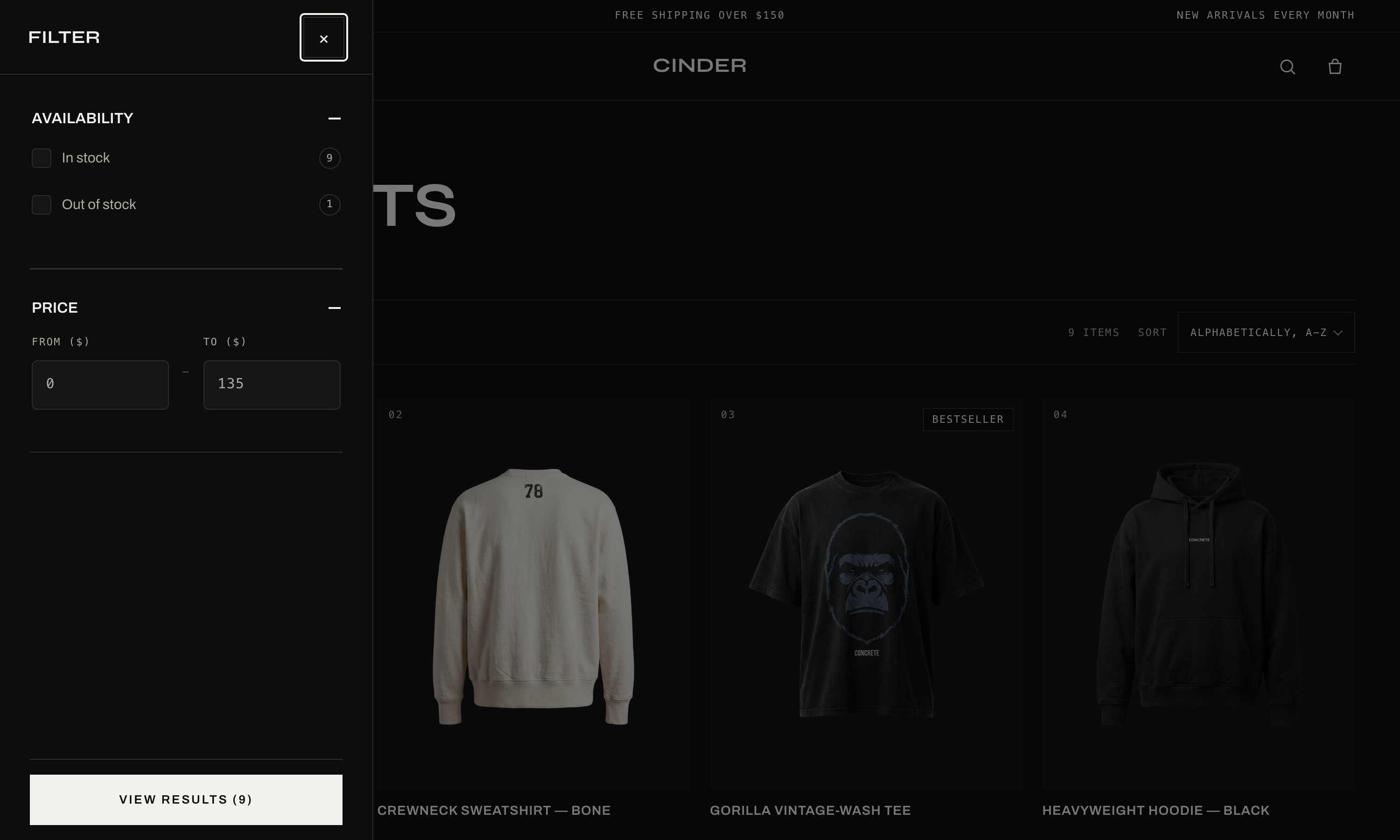
Filtering & predictive search
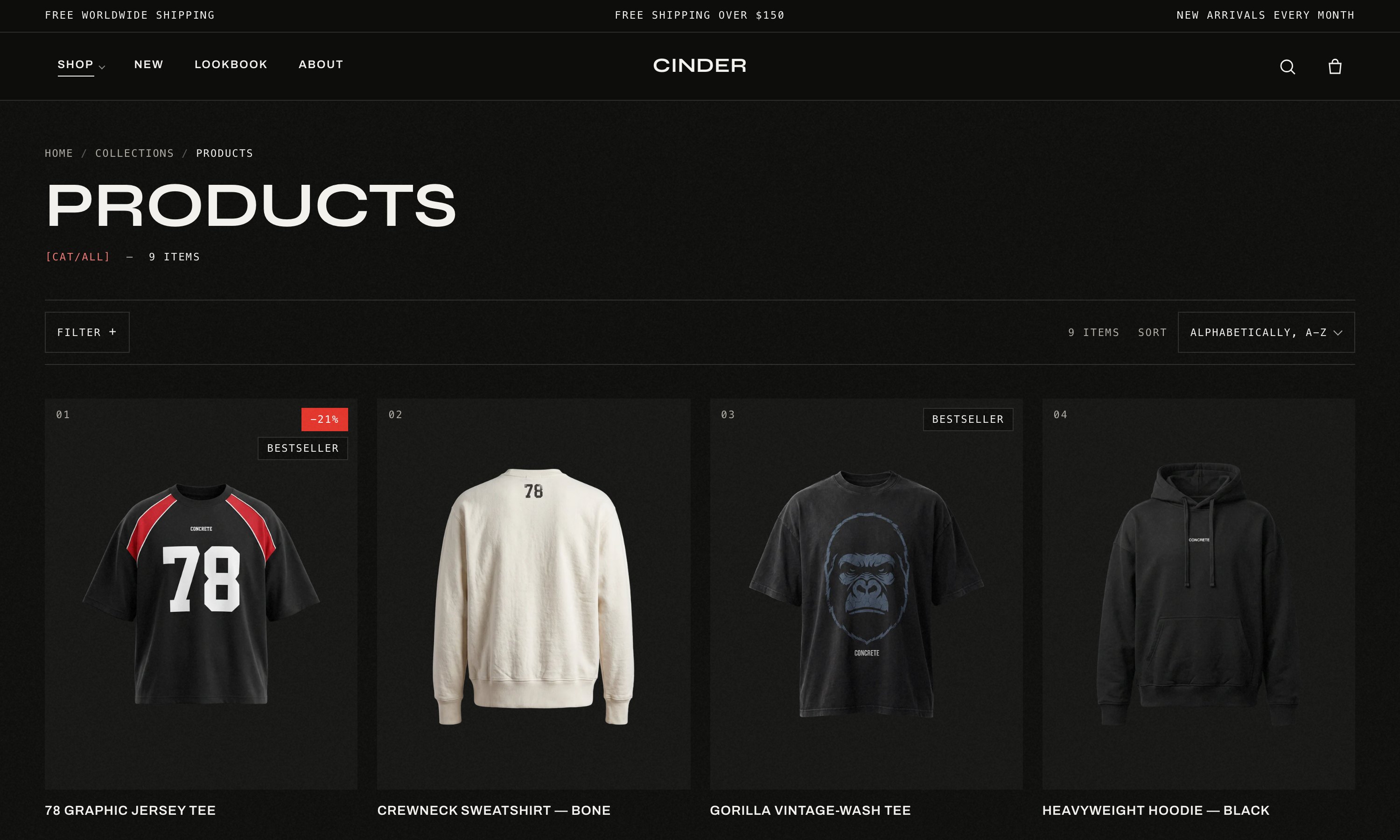
Native Shopify filtering renders as a clean, premium drawer — accent-fill checkboxes, count chips, and price ranges — with sorting alongside. Predictive search surfaces products, collections, and articles as customers type.
- Filter by availability, price, color/size, type, vendor, or metafields
- In-grid promo tiles to break up long collections
- Fast, accessible search modal with keyboard navigation
Accessible, fast, international
Cinder is engineered to pass review and serve everyone. It’s keyboard-operable and screen-reader friendly, honors reduced-motion, protects color contrast, ships responsive images and deferred scripts, and speaks five languages with full RTL support.
- WCAG-minded: focus states, labels, skip link, aria state
- Core-Web-Vitals-first: eager LCP, lazy media, zero layout shift
- English, Arabic, German, Spanish, French — RTL ready
Every detail,
documented.
A complete, searchable help center: setup, every theme setting, every section, the mega menu in depth, product & collection pages, how-to guides, accessibility, and performance.
Open the help center →team behind it.
Cinder is built and supported by SPELL. Have a question about setup, a customization request, or a bug to report? Send a message — a real person replies.